The Phasmophobia Apocalypse update is pretty OK!
It’s unassuming at first, as most Phas updates tend to be, but there’s some real meat on these bones, even if it misses the mark in some ways.
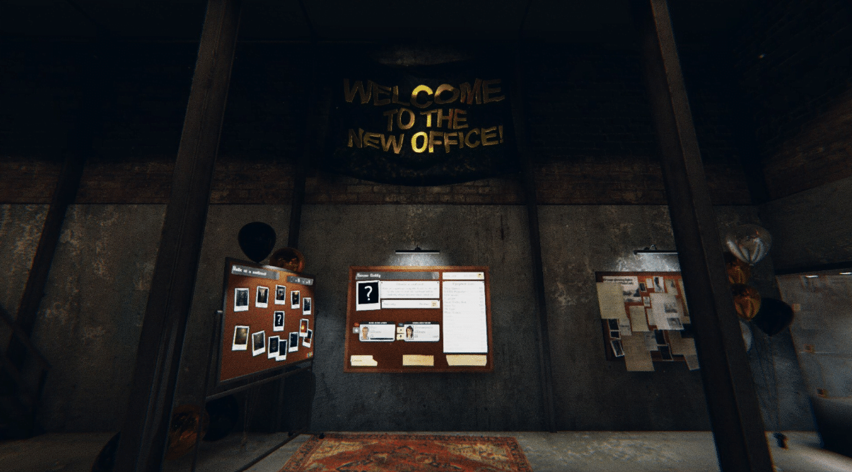
First and foremost the Apocalypse Update brings a lobby overhaul. Gone are the days of looking at a giant whiteboard in the back of a dirty garage.
Your team of ghost hunters acquires a new office.

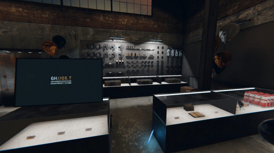
Complete with display cases to show the cursed objects you’ve collected, a cozy game room to kill time between matches, and a new shop interface to purchase equipment through.
It’s a notable step-up from before. The map selection has changed to an evidence board where everyone in the lobby votes on where to go. It’s a nice little feature and looks way more official than the previous whiteboard US map interface.
The same goes for the character and stat menu. It’s sleek, the information is easily readable, the whole thing just looks intentionally designed and sensible. The equipment list is clearly displayed in the lobby bulletin, and all menus are easily snapped to with the click of the space bar. Good stuff.
The Apocalypse update also brought a great renovation to the shop menu. It now features a computer interface, item icons, and load-outs. Items are easily purchased and inventory is tracked in a simple stock list on the right side. There are categories of “main” and “optional” equipment easily distinguishable.
The loadout system itself however is a little clunky. You have two starting load-outs and it isn’t particularly intuitive to set up and divide inventory among them. And ensuring you’ve added your specific equipment to the team’s pool is as confusing as ever.
I also don’t entirely understand the point of load-outs in Phasmophobia. This isn’t a game where each team member needs to bring specific gear, there are no classes or builds to be had here.
Usually, planning gear comes down to “Who can afford more cameras?” and the person with the most cash just foots the bill to fill out the remaining equipment. Cases like these mean pre-made loadouts don’t really help. Maybe this is the groundwork for more structural changes in the future.
The next big addition is the inclusion of a re-worked asylum map, named Sunny Meadows.

The devs remade the map from the ground up in an ongoing effort to phase out premade assets. It’s a good move and a good sign toward the long-term vision of the game. And while it’s a commendable effort by the team it misses the mark in a few ways.
But the map has some problems. Firstly, it’s huge.
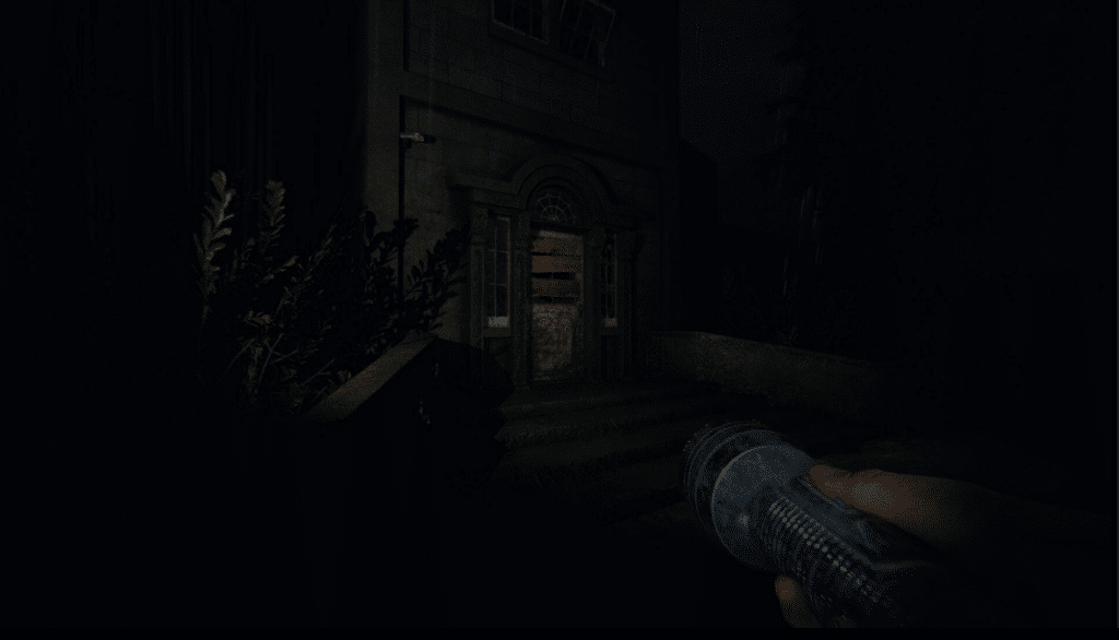
It opens into a small foyer which immediately cuts to a staircase that leads downstairs. Left and right are paths that form a circuit around a square map. A dense courtyard fills the center and grotesque padded cells and cluttered hallways make up the lower level.
There is a lot going on this map, which is one of its weaknesses.
Firstly, it doesn’t feel like a Phas map.
Up until this point, your team of ghost hunters has been sent out to small houses and cabins in search of ghost hauntings. It’s a humble premise and the maps have reflected that. There isn’t anything too out of the ordinary going on right out of the gate.
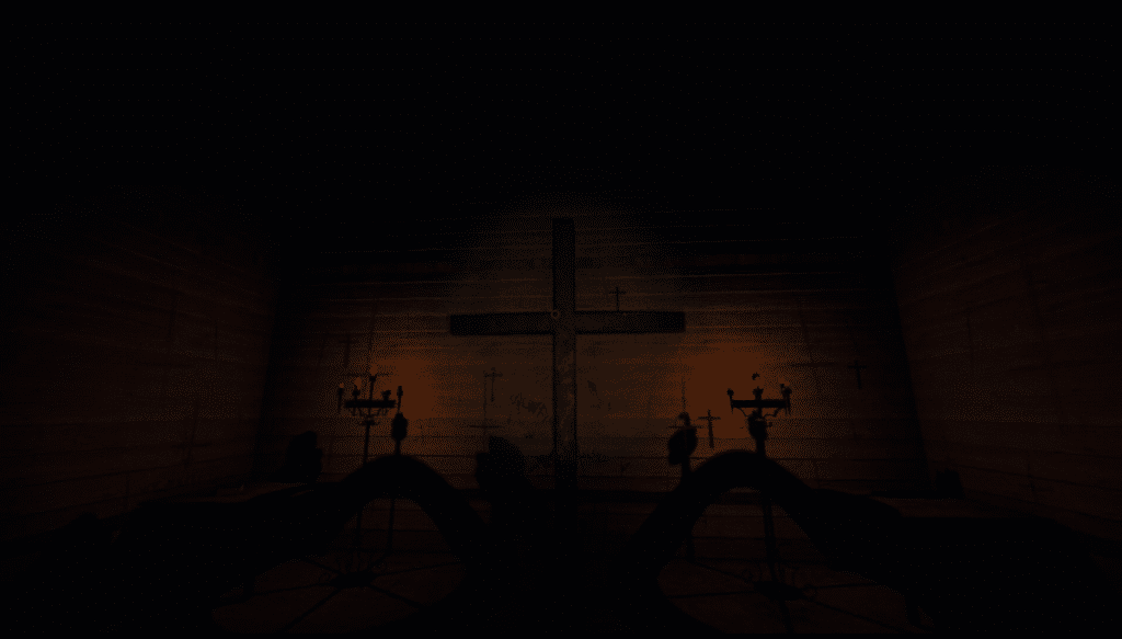
Here, things are clearly already bad. Gore splatters the hallways, the padded cells are filled with torture equipment and bones. Hell, the residing chapel in the facility is lit by ominous candles and marked by demonic sigils. The cross in the back of the room even flips upside down if you look at it. Pretty heavy-handed stuff.

All this undermines the eerieness of the other levels.
I know that most of these levels are made with pre-built assets but they felt normal, and there’s nothing stopping the devs from making believable places to investigate. Why are we being sent to investigate a condemned asylum that should really be a crime scene? It just doesn’t fit for me.
The bigger problem this map faces is the same one the original also faced. It’s just too big. Two floors, dozens of rooms, courtyards and chapels, crowded hallways, and stairwells. Your sanity will be zero just by walking the grounds well before you come across a single piece of evidence.
The hallways are a pain to navigate as they’re all broken up by overturned bookcases or privacy screens that cause you to zig-zag your way around, which is a huge pain if you’re setting up a DOTS projector as your sightlines are constantly broken up.
On the other hand, some of the patient rooms are so small it feels impossible to set up a good camera location, and if more than one player is in the room it’s far too cramped–a similar issue some of the tents have on the campsite map.
It all boils down to that the systems within the game currently don’t allow for these larger maps to be fun.
The sanity system is too punishing, the investigative tools you have to track down the ghost in the initial stages are too limited and uninvolved, and the inventory system too limited, making trips back and forth from the van a pain.
Hopefully, Phasmophobia continues to grow and the depth of the systems in the game will continue with it to make these larger maps more enjoyable.
Finally, there’s a smaller variant of the campsite map. It feels like an odd choice as the map was already a rather small affair. This one is really compact and the few open spaces and an assortment of tents make for a great beginner-level or a “just one more” outing to wrap up a night of ghost hunting.
To summarize, the Phasmophobia Apocalypse Update is another step in the long journey Phasmoohobia has ahead of it. The changes to the lobby system are all great, giving a more intentional feel and layout that the game has needed for a while. The asylum map has some great–if not out of the place-art direction and ultimately falls into the size trappings the previous version of the map face
