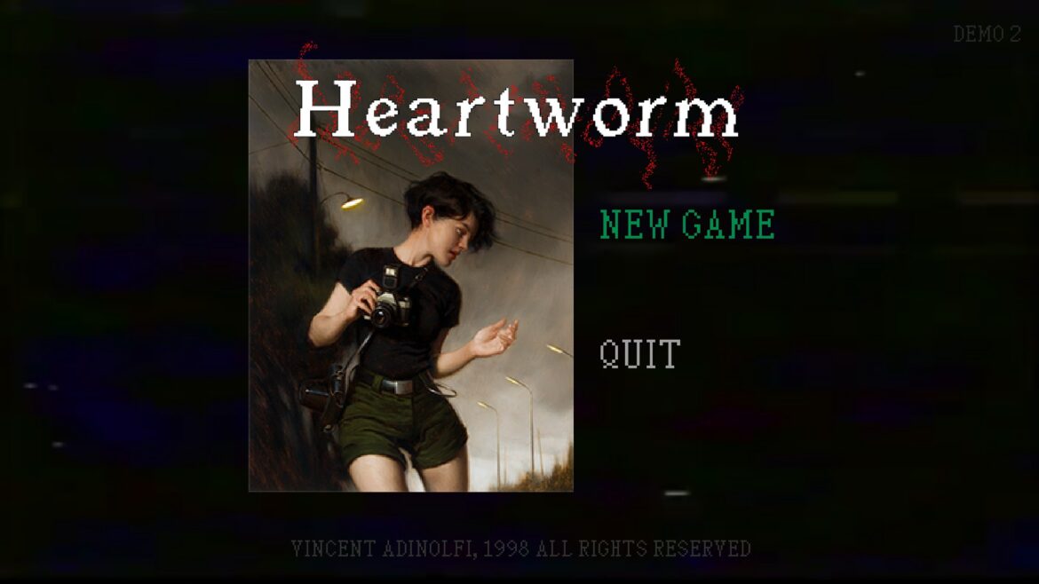
Heartworm is an upcoming retro horror game developed by Vincent Adinolfi. First released for the Steam Scream Fest, this short teaser leaves a fantastic first impression.
Indie devs are more and more embracing a low-poly art style over chasing modern graphics. It’s something I love to see because PS1-era graphics have ascended to the realm of stylized instead of outdated. Unsurprisingly, this style evokes both the nostalgia of playing horror games like Resident Evil and Silent Hill as well as the surreal and unsettling atmosphere that made those games legendary. And from what’s on display here, Heartworm understands this.
Horror is all about leaving something up to the imagination. Give just enough information to convey something wicked to the viewer while letting their imagination fill in the rest.

Heartworm does just that.
The low detail and hard shapes are an outline for us to project our fears onto. This is an art form that I thought was lost, but what I experienced in the Heartworm demo it might just be coming back.
The introduction sets the tone of the game as we meet Sam. She’s searching for rumors of a gateway to another world where you’re able to see lost loved ones. It’s a perfectly somber premise that compliments the low angst in Sam’s brief dialogue.
The setup is quiet and unassuming, motivations are clear and the mystery of the world is talked about in such a way that evokes vague early 2000s chain emails and second-hand whispered rumors. Good stuff.
You’re quickly dropped off beside a washed-out road, a wall of fog-covered trees canvas the background. An overgrown, oppressive house looms over you.
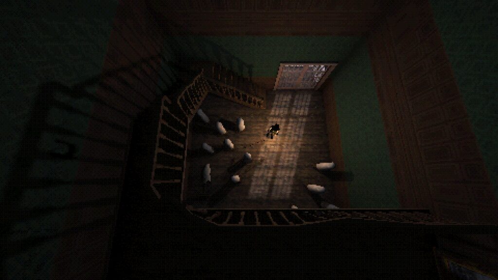
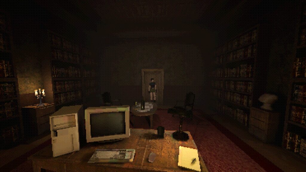
You explore the inside, pawing forward between fixed camera angles that tentatively lead you along. Whether it be positioned in the corner next to a lamp, or cradled in the darkness of a ceiling like a spider’s POV, the camera locations in the Heartworm demo are perfect.
Care is needed when utilizing the fixed camera angle. It’s not as easy as just popping one in the corner of the room. It’s like establishing a shot in a movie. Each scene needs to provide some direction to the viewer. Tease the layout of the space, provide a means forward and gently highlight the points of interest.

Combined with the intentionally placed camera angles, there’s a beautiful silence to Heartworm. It’s wonderfully underscored, tense, and foreboding in its stillness.
It’s punctuated by Sam’s sharp footsteps and the bouncing, Silent Hill-esq inventory sounds. Creaky doors transition you from room to room and a tenuous save-room melody evokes being trapped in the Spencer Mansion.
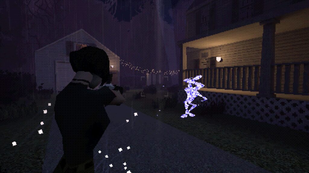
However, Heartworm quickly sheds its layer of normalcy as you rush toward an otherworldly zone. You’re transported to a dark, rainy neighborhood. This transition is established by a great POV shot of a creature that lumbers out of the shadows, initiating Heartworm’s first real combat sequence.
Starlike, staticky humanoids meander around the drenched streets. You use your camera to stun them out of existence serving as a suitable and recognizably clunky defensive item. Are these entities the lost souls of others who came in search of this place?
The enemies are perfectly slow while possessing a surprising ability to catch up to you when stunned by their attacks. While their static-like appearance seems to fit aesthetically, I’m hopeful to see more creative enemies in the full release.

Fighting or fleeing, you pass by numerous houses. Some blank, others emitting strange sharp glows. Heartworm never felt more Silent Hill than it does here. I felt like Harry Mason, small against the backdrop of mute, normal while simultaneously alien buildings. As a result, Heartworm looks so authentic to the era it’s inspired by.
A few more puzzles and a transition to a snow-covered neighborhood round out the demo. I have to note the interiors in this game are fantastic and packed with detail. I loved searching around and reading the text inspections every time they came available–These are a grounding feature for these types of games, and serve as a versatile tool to give insight into the character and world they inhabit. Good stuff.
As this is only the demo, I hope for a longer introduction to the otherworldly corners of the game. A little buildup and exploration will go a long way in evoking that surreal, impressionist feel that just drips from the art style. I wished to spend a little more time investigating the strange house at the beginning, simply because the atmosphere in that area was unmatched. It’s hard to maintain a spooky, intimate feeling when you delve into the unreal, so I hope the full release of Heartworm gives the player some quiet moments.
Still, I’m eager to spend more time in this world and learn more about Sam and the implications of what her journey means.
To summarize, the Heartworm demo gives a great, succinct slice of what’s to come. From the talented use of fixed camera angles to the perfectly clunky combat, the ominous pixilated style and foreboding world, this looks like a daydream of a bygone era I’ll happily slip into.
You can wishlist the game and play the demo on Steam here
